Pixel Art
I'm hoping to practice and improve my pixel art skills. To that end, I'm aiming to do at least one of the Pixel Dailies a week, assuming there is a theme that inspires me. I'm not a true artist by any stretch of the imagination, and quality may vary wildly. Consider these experiments and exercises.
inauguration
 alt
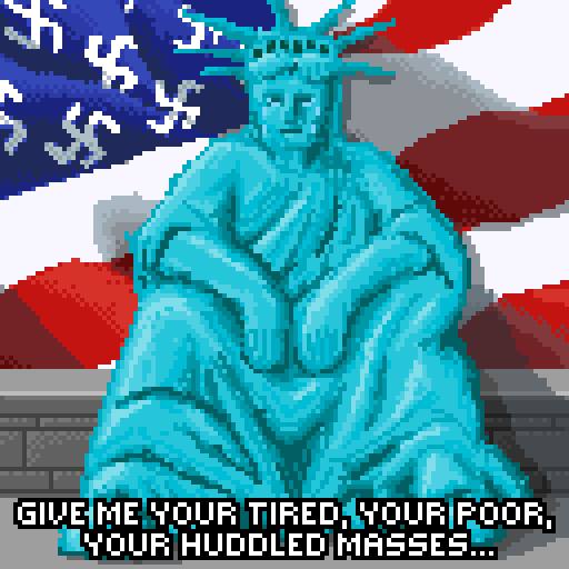
altThe Statue of Liberty sits, crying, in a dejected pose. In the background, an American flag with swastikas instead of stars. At the bottom is an excerpt from The New Colossus, reading "give me your tired, your poor, your huddled masses..." The orange felon returns to the White House. Quite why half the US electorate thinks it is a good idea to put an authoritarian racist rapist pathological liar in the top job not just once, but twice, is beyond me. My heart goes out to all the innocent people who will suffer as a result of this evil.
heat
 alt
altA mostly melted candle with the flame lighting up the wax in various hues. It's been a long time since I've had the energy and inspiration to do something for the pixel dailies, but the "heat" theme made me think of a melted candle. This turned out pretty well, I think. Because of the relatively subtle shades of colour, I didn't use a predefined palette this time.
floating platform
 alt
altThe Mastodon logo sits on a raft floating on water. Nearby, the Twitter "X" is sinking into the depths. With the theme of "floating platform" I thought I'd also poke fun at a certain sinking platform...
transporter
 GIFalt
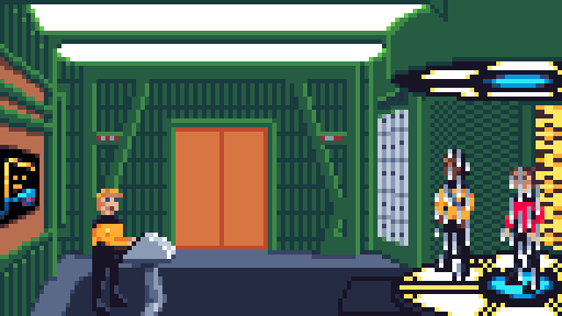
Worf and Riker standing in the Enterprise D transporter room, being beamed down by chief O'Brien. For the "transporter" theme of the pixel dailies, I could of course not resist the temptation to do another piece of Star Trek pixelart. And this had to be animated.
fly
 alt
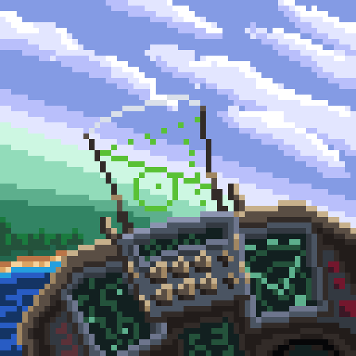
altThe inside view of the cockpit of a fighter jet flying at an angle, approaching the green shores of a lake set against a cloudy sky. For the theme of fly, I had many different ideas, but settled on this F16 cockpit inspired one. Drawing it made me want to play Strike Commander.
Mostly happy with this except for the left display screen. It doesn't match the angle of the one on the right, even though it should, and the top edge is not straight.charge
 alt
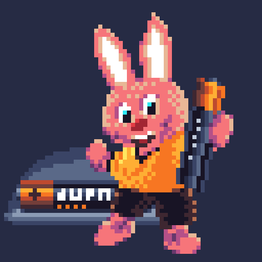
altA pink bunny wearing brown shorts and a bright orange T-shirt holds up a battery. Another battery lies in the background behind him. Hot on the heels of the "energy" theme, we now have "charge" instead.
In the US, the Energizer bunny was well known, but here in Europe, we had the Duracell bunny instead, now immortalised in pixelart. The Duracell bunny actually predates the Energizer one and has resulted in several trademark disputes between the two battery manufacturers.
My regret about this one: the battery in the background should be further to the right to make the image feel more balanced. Doing so would hide it behind the bunny itself, which can be compensated for by moving the bunny too. As is, this image is off-centre.energy
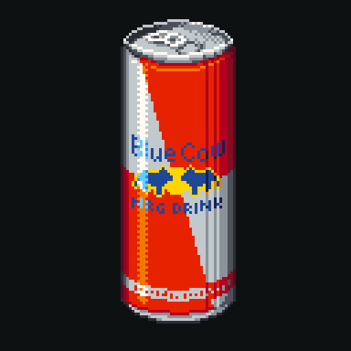 alt
altA can of energy drink labelled "Blue Cow" which is pretty much the mirror image of Red Bull. Been quite a while since I felt inspired enough to do one of the pixel dailies. But for the "energy" theme, I felt I could make some new pixelart.
It would have been easy to draw a proper Red Bull can, but I wanted to turn it around and did basically the inverse of that. Hence the fictional brand of "Blue Cow".
I'm not entirely satisfied with how I drew this. The rim around the top ends up being a bit too "pointy" on the sides and the diagonal line along the main body of the can would benefit from some anti-aliasing.phoenix
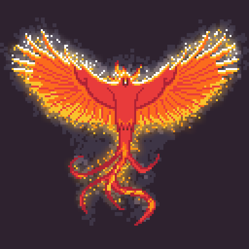 alt
altA large bird with wings spread, coloured like a flame, sparks coming off its wings, against a dark background. Today's pixel dailies theme was "phoenix". Drawn with my go-to palette of Resurrect 64 with a single blurred layer going off-palette there for dramatic effect.
I hadn't actually intended to draw the pixel dailies this day, but since I was also working on some other pixel art for a game that also included a bird with spread wings, I figured I'd use part of that and adapt it to the phoenix theme.elephant
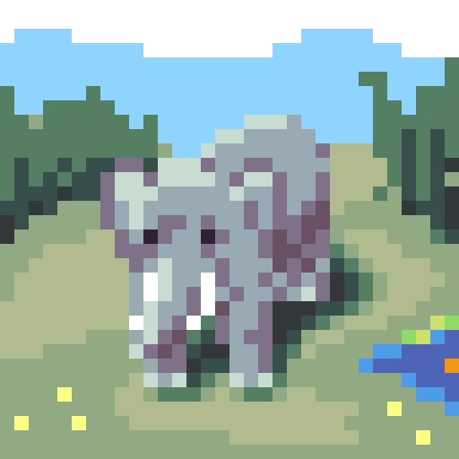 alt
altAn elephant stands in a savannah landscape beside a small body of water. For the theme of "elephant", I enjoyed the irony of making an absolutely tiny pic of the world's largest land animal. It's only 32x32 pixels.
Additionally, as the viewpoint is high above the animal, that makes it look like a baby elephant. But, as you can tell from the tusks, it really is a fully grown adult.yoyo
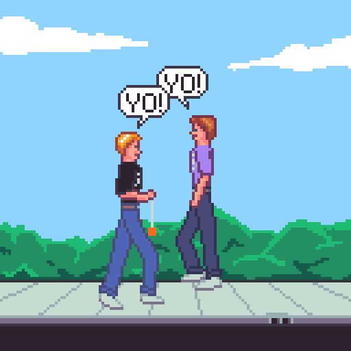 GIFalt
Two teenagers encounter each other on the sidewalk. One is playing with a yoyo. They both say "yo" to greet the other upon passing. Been busy with lots of other stuff since the last image, but I still wanna try to do the pixel dailies regularly.
The theme was yoyo and, though I have the toy yoyo in there, I also wanted to do something a little funny, so I went for another yo-yo instead. I suppose this is a quadruple yo.heaven's shore
 alt
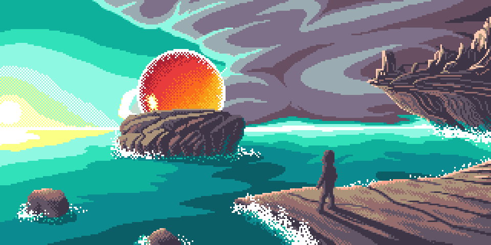
altA shadowy figure stands on a rocky surface that juts out into the ocean like a natural pier. He is looking at a rocky island upon which a spherical portal sits with warm orange glow inside it. In the distance, jagged mountainous peaks looking like the post-apocalyptic ruins of a city are on a large cliff overhanging the ocean. In the background, a bright sun shines illuminating what is otherwise a very dark and huge cloud. I've had an image like this stuck in my head for a few weeks and I had to get it out by turning it into pixelart.
And no, I've got no clue what it's supposed to be either. Though it doesn't quite match what was in my head in terms of how dynamic it is or in terms of colours, it'll have to do.
I choose to think that the figure standing on the rocky slab has reached the end of their life and that the round thing on the island is a portal to heaven - hence the title.slingshot (strict)
 alt
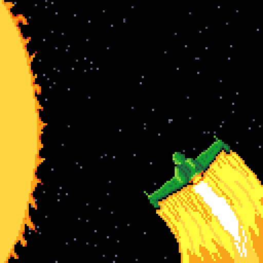
altA Klingon Bird of Prey is going in for a high speed slingshot manoeuvre around the sun in order to travel back in time. This version of the image is in pure pixel art, sticking rigidly to the palette. Star Trek IV: The Voyage Home was one of my favourite films. It featured the original series crew taking a capture Klingon Bird of Prey back in time to save Earth from destruction by bringing a pair of humpback whales with them to the future where they had gone extinct.
The manoeuvre that sent them back in time was called a "slingshot manoeuvre" as it involved rapidly swinging around the sun. And that's what made me think of this for the "slingshot" theme.slingshot (alternative)
 alt
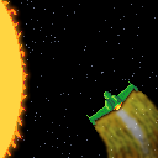
altA Klingon Bird of Prey is going in for a high speed slingshot manoeuvre around the sun in order to travel back in time. This version of the image has blending and blurring applied to give the sun a hot glowing effect and make the warp trail appear translucent. Star Trek IV: The Voyage Home was one of my favourite films. It featured the original series crew taking a capture Klingon Bird of Prey back in time to save Earth from destruction by bringing a pair of humpback whales with them to the future where they had gone extinct.
The manoeuvre that sent them back in time was called a "slingshot manoeuvre" as it involved rapidly swinging around the sun. And that's what made me think of this for the "slingshot" theme.egg
 alt
altA soft-boiled topped egg sits in a red egg-cup. A bit of the yolk runs down it. Just as I was recovering from a short but nasty flu (non-covid), the theme of #egg came up, which led to a nice and simple drawing.
If only they'd had a chicken soup theme, I might have recovered sooner!radiant
 alt
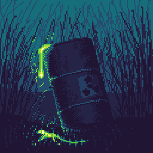
altRadioactive waste has been dumped in nature illegally. In the darkness, surrounded by high grass, green glowing sludge can be seen leaking from a barrel marked with a symbol warning of radioactivity. Some of it is already seeping into the soil. For the theme of radiant I went with a really limited palette. Humanity ought to take better care of the beautiful planet we're living on... it's the only one we have available to us.
Whether the waste is radioactive, toxic, or even when it isn't, it should be handled responsibly.super mario
 alt
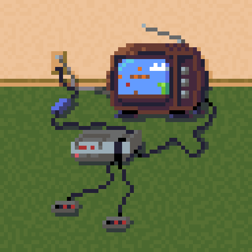
altAn NES console is connected to a CRT TV displaying Super Mario Bros. The backdrop has dark green carpet and cream coloured walls, evoking an early 1980s atmosphere. For the theme of Super Mario, an NES running the iconic game. It's drawn using 29 colours total (26 from the Dawnbringer 32 palette, but 3 shades added to create a subtle grainy noise on the carpet and wall).
Nitpickers will notice that this image isn't actually possible, at least not without pausing the game, as the single red pixel representing Mario is in the air, indicating a jump, but nobody is holding the controller to press the A button!won't let go
 alt
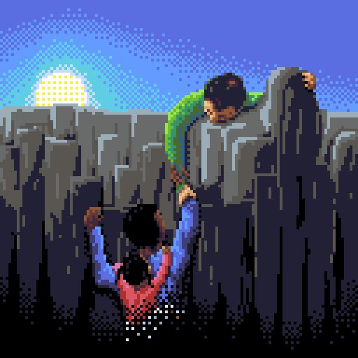
altA young black man is climbing out of the darkness towards the sun shining above a cliff. His baby daughter is clinging to his back as he carries her. On top of the cliff is an older white man, grabbing the young man by his wrist, making sure he won't fall and helping to pull him up to safety. Someone requested "can you draw something showing that I'm struggling, but with you there not giving up on me... my saviour?"
This young man has had a difficult life and has to contend with a horrific disease. Despite his circumstances, he will sacrifice pretty much anything to care for his daughter, who will turn 2 years old in a few weeks. In a few days, he will fly to a clinic abroad where he may get surgery that gives him at least a fighting chance of recovering his health.
So, this is what I came up with. A bit of a metaphorical self portrait, I suppose. I wanted to put in there that, while I may have helped a bit and he needn't stand alone, his own efforts in getting out of the darkness should also not be dismissed. And I hope more than anything that he'll get the chance to see his baby girl grow up into a strong young woman, and that she will get to grow up with the support of her loving father.goldfish
 alt
altA round glass bowl with some gravel, aquatic plants, bubbles and a goldfish that is looking off to the right by the water surface. A quickie for the theme of "goldfish" as I didn't have a lot of time for the pixel dailies because I'm working on some other exciting pixelart too. But that will have to remain a secret for (quite) a while.
heavy (main)
 alt
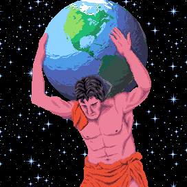
altThe titan Atlas, from ancient Greek mythology was condemned by Zeus to bearing the weight of the world on his shoulders. A huge muscled figure carries the globe on his shoulders set against a starry backdrop. Today's pixel art theme was "heavy". I went with the titan Atlas from Greek mythology... you know, the one condemned by Zeus to carry the weight of the world on his shoulders.
With the components I had drawn, specifically the globe and the starfield, I could make two versions. This is the serious first version...heavy (alternate)
 GIFalt
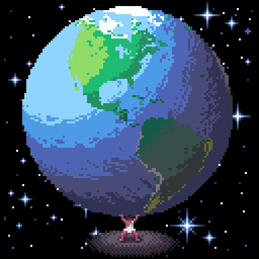
A tiny version of Atlas stands on... something... in the middle of space and holds up the entire world. His arms and knees are buckling under the stress. Today's pixel art theme was "heavy". I went with the titan Atlas from Greek mythology... you know, the one condemned by Zeus to carry the weight of the world on his shoulders.
With the components I had drawn, specifically the globe and the starfield, I could make two versions. This is the comical and animated second version...creeping plant
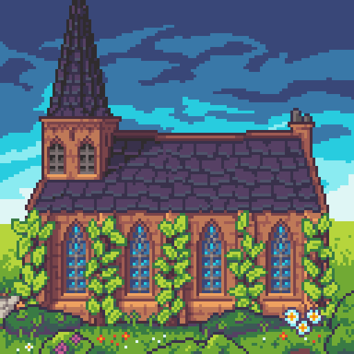 GIFalt
A small church stands before a deep blue sky amongst luscious foliage. Five creeping ivy plants make their way up the church walls. For the theme of "creeping plant", doing an animation makes a lot of sense. A cross-fade between the different frames gives a nice sense of movement. I also wanted to try a bit of a different style this time, and instead of lots of dithering, this one uses much more solid colours and some outlining around important elements.
The church itself was based loosely on that in the small Dutch village of 't Woudt.stage magician
 alt
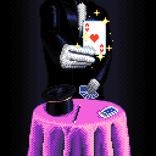
altA magician stands behind a round table with a top hat, magic wand and pack of cards on it. In his left hand, he holds the deck of cards. With his right hand, he magically presents your card, the ace of hearts. The composition and proportions aren't entirely as I'd originally envisioned, and I don't like the way the left hand came out, but I think overall this image for the theme of "stage magician" works pretty well.
The lack of a face is intentional (not just because portraits are hard) to draw the attention to the card and props. The sparkles serve many purposes: without them, the image looks dull rather than magical, they draw the eye to the card, and they help bring in a bit of contrasting colour.savepoint
 alt
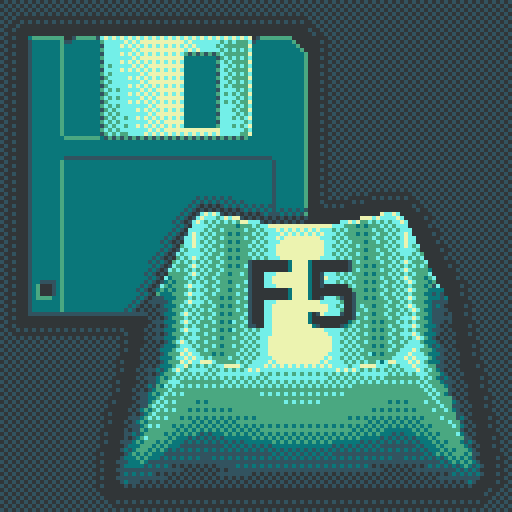
altA 3.5" floppy disk with a large F5 key in the foreground. Drawn in a heavily dithered bluish green palette reminiscent of older LCD games. To be honest, I'm not very satisfied with this one. But that, to me, is the point of doing these pixel dailies: to try things out and to get better by seeing what works and what doesn't. I played a lot of adventure games growing up, particularly by Sierra and LucasArts. And F5 on the keyboard brought up the Save Game box in those games.
I wanted to do something with this palette, but I don't think it's the right choice for this image. And the F5 label requires a bit more perspective foreshortening, though I didn't manage to get that to look right. Oh well, that's how we learn.legend
 alt
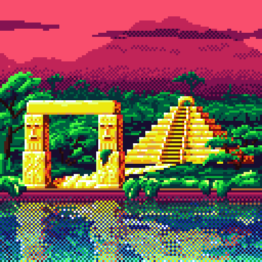
altA golden ziggurat in a junglescape with a golden road leading to a golden archway by the riverside. A silhouette of a mountain range is visible against a crimson sky in the background. My initial thought for the "legend" theme was the sword Excalibur in the stone. But since many people had that same idea, I instead went for the Golden City, El Dorado. That deserves some bright and saturated colours.
I may have gone a little overboard on the dithering in the reflections in the river (all the dithering was done by hand) but I think the result looks good, so it's worth the RSI.snap
 alt
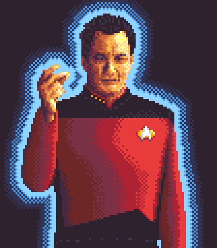
altA pixel art rendition of the near-omnipotent entity Q from Star Trek performing his signature finger snap. With a theme like "snap", one thing immediately springs to mind: Q, the near-omnipotent character from Star Trek. Remind me never to draw a pixelart portrait again, as it's ridiculously hard given my limited skills.
It took ages of tweaking to make this look somewhat like John De Lancie, especially with a limited palette. Still not sure I got it right and I hope he's not too offended.move
 GIFalt
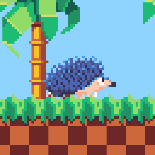
A bluish hedgehog racing across a tiled backdrop of grass and palmtrees. It appears to be wearing red sneakers and white gloves. No prizes for guessing which video game character inspired this one, when it's so obviously Nintendo's Mario. I subverted the "move" theme a bit by having everything in the animated version move EXCEPT the character body.
cheese
 alt
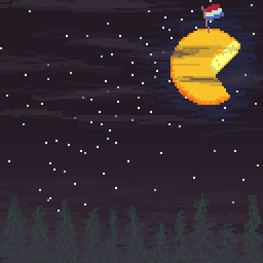
altPixel art image of a night sky with a large wheel of Gouda cheese serving as the moon. A small Dutch flag sticks out of the cheese moon. Now, everybody knows the moon is made of cheese, but I'm a Dutchman and here in the Netherlands we're more specific. It's a glorious Gouda!
There is some deviation from the palette by using some layers that are blended because their opacity is not 0 or 100%.containment
 GIFalt
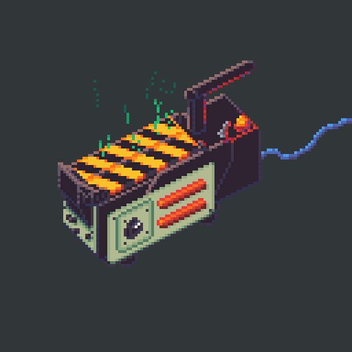
A ghost trap as seen in Ghostbusters, that has just been used to catch a ghost. For the theme "containment", I chose the ghost trap from Ghostbusters. This one is animated, too.
Although I'd originally wanted to do a wisp of smoke, I ended up doing green ghostly energy instead.eyes
 alt
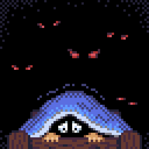
altA trembling person peeking out from under a blanket, looking terrified. With five evil-looking pairs of red hours in the background. Having a bit of fun with the theme "eyes". One thing I learned from doing this one is that having a bit of vignetting with a lighter colour in the corners makes the black appear darker. Also picked an existing palette in advance.
aim
 alt
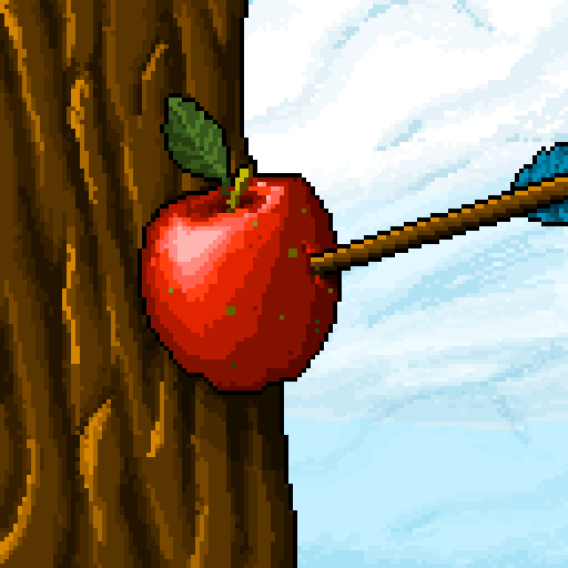
altAn apple skewered onto a tree by an arrow. The theme for this one was "aim", so I elected to go with the legend of William Tell shooting the apple.
There was no careful selection of palette and I just used whatever colours I felt I needed. I don't think I'll do that again, as it feels somewhat messy.