In 2012, the designers of the Space Quest series of adventure games, Mark Crowe and Scott Murphy a.k.a. the Two Guys from Andromeda, ran a Kickstarter campaign for creating a new game in the Space Quest vein. The campaign was narrowly funded. And now, a decade later, in September of 2022, SpaceVenture was released to backers.
I'm going to start out with some background information about the Kickstarter campaign and the game's development here. If you're only interested in what the game is like, feel free to skip ahead to the actual review.
What happened?
During the campaign, the intended release date of SpaceVenture was late 2013. Having secured their funding (though no stretch goals), the Two Guys got to work writing and designing their new game, creating the art for it, doing the programming (of not just the game itself, but also a custom framework on top of Unity), securing voice talent etc. Unfortunately, with the one year period long gone by, SpaceVenture entered development hell. Updates slowed down and eventually ceased altogether, backers got upset (with a small but very vocal and truly contemptible minority spewing pure hatred in the Kickstarter comments, drowning out all positivity and encouraging words), and it seemed like the project was dead, despite the occasional claim that it was still being worked on.
The Space Quest series that propelled Mark Crowe and Scott Murphy to adventure gaming fame was created at Sierra, with their in-house tools on the AGI and later SCI engines. These games commonly ran at a resolution of 320x200 pixels in 16 or 256 colours, with Space Quest IV marking the transition from 16 colour EGA to 256 colour VGA and from a text parser to a point and click interface. At the time, that was just making good use of the available technology. Nowadays, we tend to call the resulting art style "pixel art". Many classic adventure game fans adore that pixel art (I do too!) and will dismiss anything that is somehow related to those classic games and isn't pixel art (that, I don't). Ron Gilbert can attest to this when he showed the art style for Return to Monkey Island. For SpaceVenture, that wasn't the case yet, though. And whether it was due to pressure from the backers or the Two Guys' own ideas, the decision was made early on to go in a more contemporary art style with fully 3D animated characters, props, and, although I think the original intention was to have prerendered backgrounds with several 2D layers, there seems to be extensive use of a lot of 3D elements or background geometry to enable perspective shifts and pans or zooms.
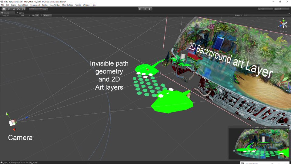
This precluded the use of systems like AGI or SCI and publicly available alternatives like AGS (Adventure Game Studio) and meant that the use of a proper 3D system was required. Mark Crowe, being the person to do most of the actual coding, settled on Unity. This may have been a major mistake. Not that Unity is a bad product in and of itself, but at the time, it wasn't really suitable for point and click style games, as extensions like Adventure Creator or Power Quest just didn't exist at the time. Switching from something like SCI to having to build a whole framework on top of a 3D engine is a big deal and being great at one of those doesn't mean you'll be great at doing the other too. The choice to do things in Unity (and having to stick with an old version, because Unity is notorious when it comes to upgrade compatilibity with older projects) cost a ton of extra effort. Speaking as a hobbyist game programmer myself, I know enough to say that saving and loading game state is one of the hardest things in game development. And indeed, the save/load system has apparently been the major headache for the last few years of SpaceVenture's development. Supposedly it was fixed and SpaceVenture could finally be released.
So, what's it like?
On Saturday morning, a download link for SpaceVenture appeared in my inbox. I downloaded it eagerly and played it through, twice. Completing the game once took me about 6-7 hours of playing time. Having to restart due to a bug after 2 hours or so meant that the actual time taken was quite a bit longer. The developers included a link to a walkthrough in case you get stuck. I referred to this a few times when stuck, where it mostly turned out that I had overlooked something, not noticing a hotspot. There were also a few times where I learned from the walkthrough that I'd been having the right idea, but did it in a way the developers hadn't anticipated, or there was a glitch in the game. And that is worrying, both the bug that caused me to restart and the many, many glitches.
What's good?
First and foremost in an adventure game is the story and puzzles. There, I'd say SpaceVenture gets things mostly right. While the story won't win any literature prizes, it is funny and absurd, just as would befit a Space Quest game. So, fans of Space Quest won't be disappointed in the story department. In fact, they will find plenty of references to the series and even a cameo by Roger Wilco (or at least his feet) who is taking one of his signature naps in a broom closet. And it's not just Space Quest references. Like in those games, the whole of science fiction gets lovingly parodied. You will find, among many other gags, things like Buzz Lightyear and a Wookiee in a bar, an Imperial Shuttle from Star Wars parked not far from Back to the Future's DeLorean, an Eagle from Space 1999, and even protagonist Ace Hardway acting out a scene from 2001 A Space Oddyssey. I have to admit that now, at almost 44, I am in a much better position to appreciate the humour and the references in the game than my teenage self was playing the original Space Quest games. This allowed me to really enjoy the story, the setting, and all the tongue in cheek references, visual gags and even the jokes in the dialogue much more than I could have as a youngun. Also, at 6-ish hours of play for a first playthrough (referring a few times to the provided walkthrough), I feel there's a decent amount of content.
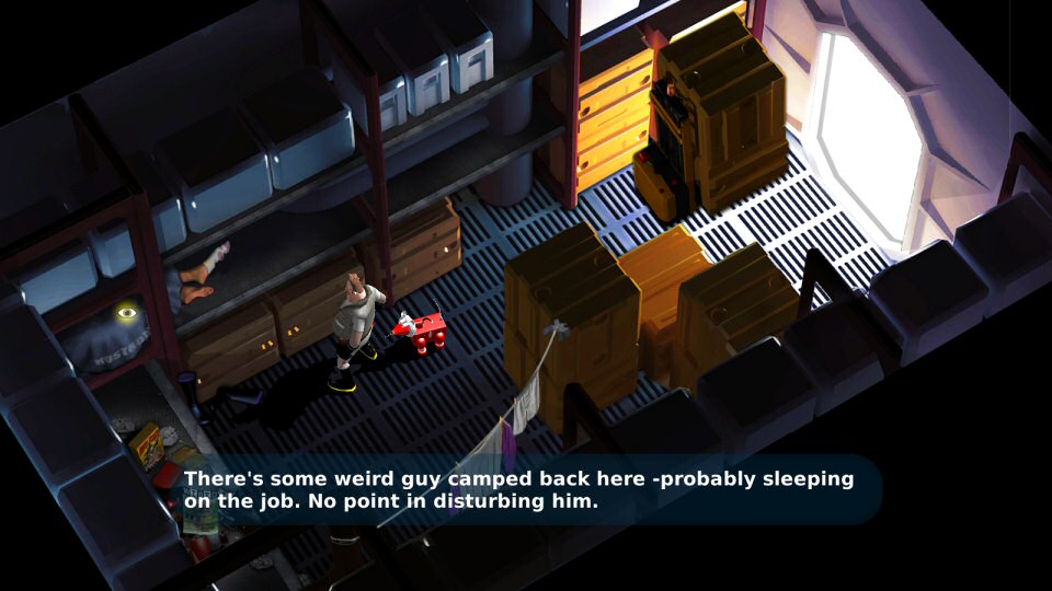
Modern adventure gamers have very little patience for the moon logic and frequent deaths of the earliest adventure games. However, as Space Quest was (in)famous for the many gruesome deaths that Roger Wilco could die, it just wouldn't be right not to have at least some of those in its spiritual successor. And there are indeed some deaths in there that I've encountered. For instance, the homicidal floor waxer roaming Vohaul's asteroid fortress in SQ2 has a few of its cousins working a hallway on the Nostrodomus and they will make short work of Ace if they catch him. Fortunately, the deaths that are there are easily avoided and mostly there for comedic effect. Dying doesn't mean game over, but just resets the scene you're in, so you can try again without too much fuss. And like unfair deaths, moon logic is mercifully absent from most of the game. There's a few things that aren't terribly sensible or could be signposted better, but on the whole, the puzzles are pretty logical and make sense in the game world. There's also some more direct object interaction by making using of a dragging mechanic. Not everybody's cup of tea, but I liked it and feel that it adds some novelty to the puzzles where it's used.
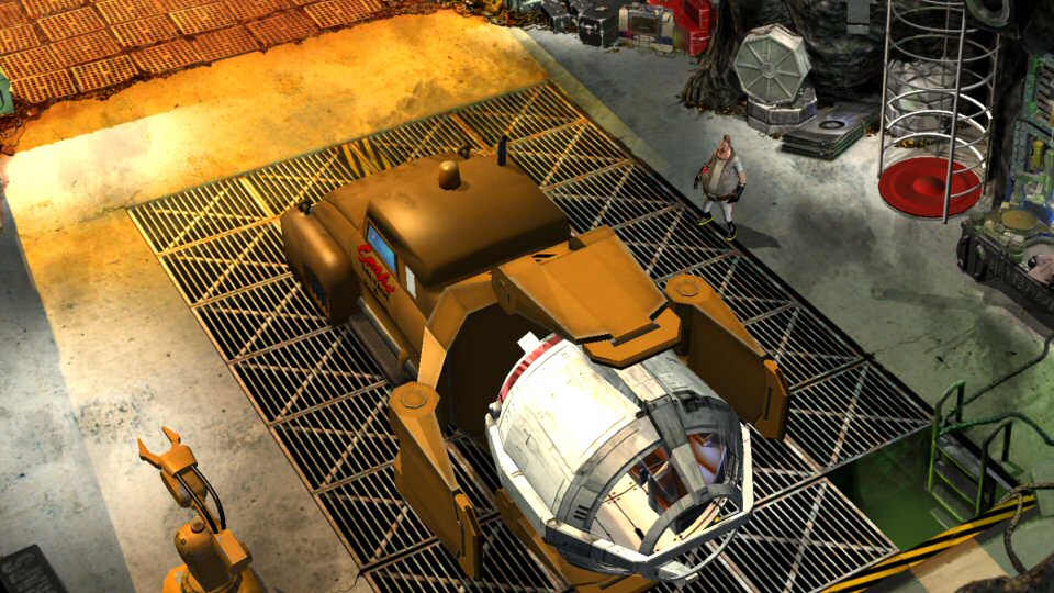
Pixel art is now considered retro or having a timeless aesthetic, and has many fans. In the early days of 3D being used in adventure gaming (think King's Quest: Mask of Eternity, Simon the Sorcerer 3D, or even games that used 3D character models only, such as Escape from Monkey Island and Grim Fandango), the technology wasn't very mature, artists were still getting to grips with it, and the 3D graphics from those games haven't aged well. In the era since then, full HD graphics have become commonplace and 3D accelerators have improved tremendously. Graphics from the early 2010s have aged much more gracefully and I think SpaceVenture graphically holds up. In my personal opinion, the environments of the game look quite good, making very good use of static and 3D elements, even on simple screens like the title screen.
The audio side of things is very well done too. Veteran Space Quest composer Ken Allen (whose score was arguably the best thing about the VGA version of SQ1) also did the original musical score for SpaceVenture and it fits very well. Sound effects are pretty much perfect, to the point that I never felt any sound effect to be inappropriate, jarring, or out of place. And finally the voice acting is done by some very talented people, with the least inspired performances actually coming from Mark and Scott voicing themselves in the game (understandable, as they're game developers, not voice actors). It's a pity Gary Owens died before he could record for the narrator. Ed Kelly did a great job lending a very Owens-esque quality to the narrator, though. There's even several songs in the game: an over the top performance by 3 habaneros at the Taco Nova restaurant (supposed to be annoying, but I actually found it quite catchy and amusing), and a rock song when Ace gets pulled over by a space cop.
What's not good?
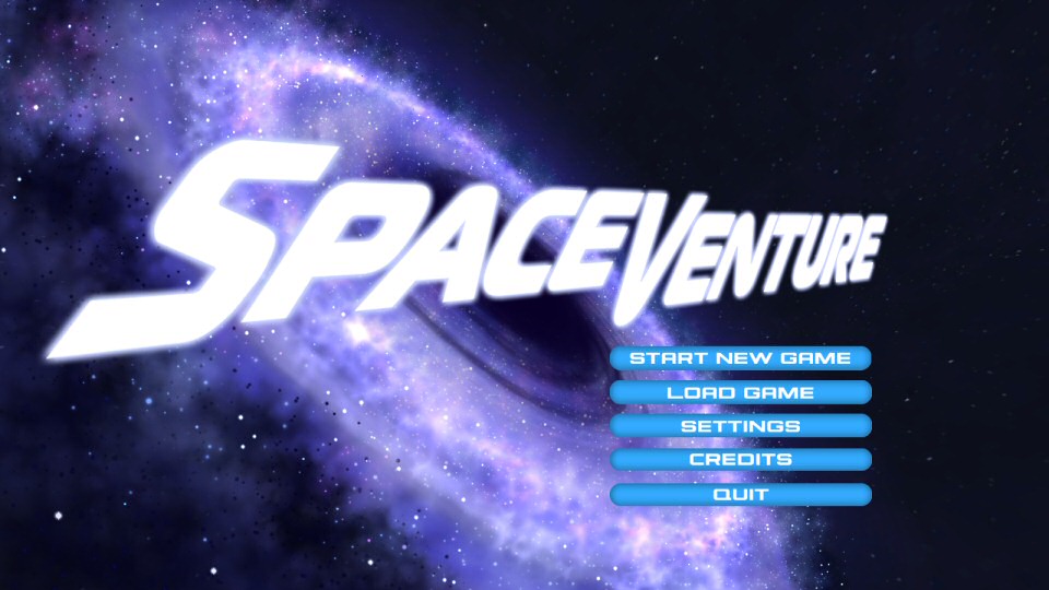
Oh boy... here we go... I've been dreading to write this part, because it saddens me. Although the game was "released" to backers and has been in development for 10 years, the truth is that this version of the game really is more of a semi-public beta. Even on the title screen shown at the top of this post, the "Settings" button does nothing and that is far from the only thing making the game feel unfinished. There may be some jerky transitions in animations or characters clipping through each other or the scenery, but I can forgive those as merely minor cosmetic issues. However, there are many, many glitches, some of which can lead you to be stuck on a screen through no fault of your own. The camera might zoom to a place and get stuck there, making it impossible to leave the screen. Sometimes, but not always, can you fix this with some vigourous maneuvering, sometimes by triggering another scene transition, sometimes there is no other way than to reload the scene. Actually, make that "restart the scene".
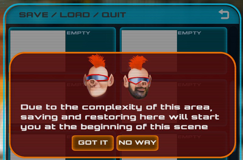
As mentioned before, the save/load system caused the developers a lot of headaches and, although it was supposedly fixed, I would dispute that claim. Rather than a proper save/load, it is more like a checkpoint system and whenever you save the game, you will always see the above warning pop up. In practice, I haven't found this as much of an issue as it would seem to be, although having to redo a significant number of actions in a scene does discourage using the save system to experiment in the game world. This is a real pity and although saving and loading is admittedly a pretty hard thing to do and to get right, it's not impossible.
Although I got used to it pretty quickly, I would definitely agree that the UI is unpolished and unintuitive. Knowing when you can drag an object, how to combine inventory items, or how to activate certain things is not always obvious. This was remarked on by many players during beta testing and I'm surprised it's still an issue in this supposedly final product. There's one point where you are flying around Ace's ship as his dog/toolbox Rooter, trying to hit a certain location. The controls were so unintuitive that it took me over 15 minutes of orbiting and overshooting before I gave up, reloaded, and ever so slowly inched my way to the correct spot. While all other arcade style sequences in SpaceVenture are skippable (and that's a good decision to allow people who don't enjoy such things to get on with the game), this particular sequence cannot be skipped.
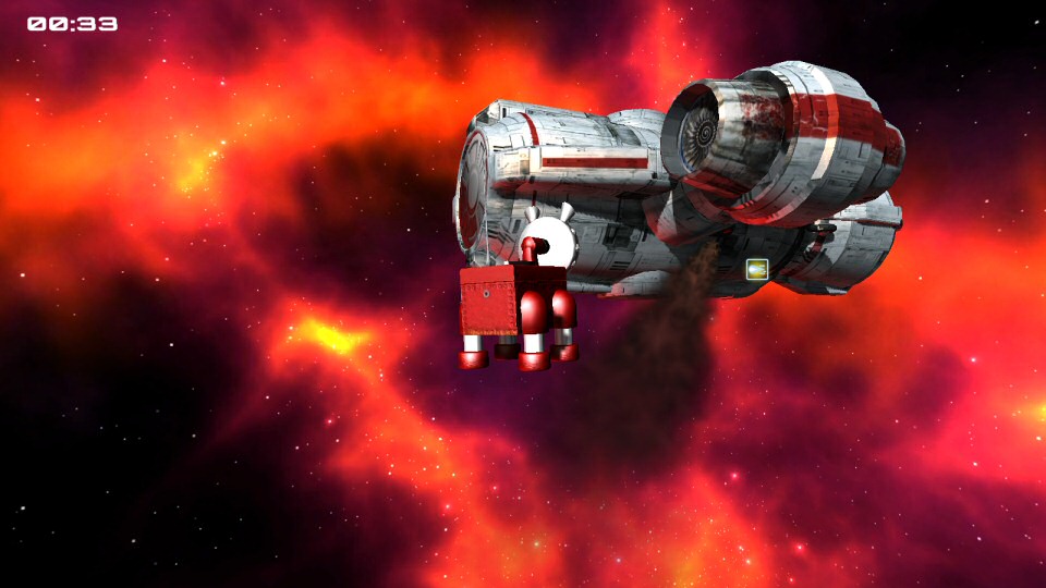
It is also very easy to get the UI in an inconsistent state, with things overlapping in the wrong order. Hotspots are frequently not registered (or only register when you're standing in specific places, without so much as a classic Sierra "you're not close enough" message) and often don't make the cursor light up appropriately. Clicking the mouse to skip a line of dialogue you've already heard (or even clicking some UI elements) also counts as a click on whatever scene element the cursor's currently on. That's bad and frequently leads to an annoyance where, instead of skipping the dialogue, it actually restarts that very same line because the game thinks you're performing the same action that triggered it in the first place. Quite a few lines are displayed as text only, with no voice-over playing; there's a few instances where the wrong line plays and doesn't match the text, and some where the text disappears before it can be read. Skipping lines of dialogue or entire cutscenes often doesn't work reliably, with the game basically waiting out the time it takes to complete the cutscene normally. Now, while these aren't game-breaking bugs per se, they do betray some major issues with the game's coding. And some do break the game. At one point, I made a creature disappear, probably by triggering something else before its animation had completed. This led to having to restart the scene as there was no way to progress otherwise. And the worst I encountered was the game not restoring player control after a cutscene. Not even reloading fixed that and the only thing I could do was restart entirely.
Conclusion
The backer release still very much feels like a beta. I didn't participate in beta testing, so I can't be sure, but nobody doing beta testing will have missed the issues I and others have encountered. One thing that can cause quality of a game to suffer is when those testing (usually the developers at first) know precisely how to play. If you play through the story again, knowing exactly how to proceed, you encounter few of those glitches. That's why it's important to have fresh eyes doing your testing... people who can't get to the end of the game with their eyes closed.
Having played through the game multiple times, I have mixed feelings. On the one hand, I think there's a good adventure game at the core, I love the way it looks, and I did enjoy playing it very much. The game even got a few proper laughs (rather than just chuckles) out of me for references, jokes in dialogue or plain wackiness. On the other hand, it still very much feels like beta software and I feel the decade long development time should have been enough for it not to be this glitchy. On the whole, I'm glad I finally got to play it, I don't feel cheated as a backer, I can appreciate the amount of effort that has gone in and I had fun.
While SpaceVenture is so unfinished, I can understand the developers just wanting to be done with it and all the negativity surrounding the development, and get something in the hands of backers, which I appreciate as a backer and a fan. While I hope they will fix all the glitches and bugs, and the developers have said they are doing just that, working hard to solve all the problems backers are encountering, I'm a bit skeptical about that. These things were known, and have been for years. Though I must admit to being positively biased into liking it, I don't think I can recommend the game to people who aren't die-hard SQ fans, at least not in this state. SpaceVenture is, in my opinion, not ready for public release. It wouldn't do the developers' reputation any good, and they would get eviscerated in the reviews. That would be incredibly sad, especially after all the blood, sweat and tears these guys have already put in. I had a fun time playing, and I think there's a good adventure in there, but it needs a lot of tlc first.
Comments
Wow, thanks for this review! As a backer and a die hard SQ fan myself (as well as a software engineer) I really couldn't sympathize more. The Unity mess does explain a lot of things.
Unfortunately, to say that experiencing the game after 10 years of anticipation was anticlimactic would be the understatement of the decade :(
I never actually played it through... Eventually (I suspect just before getting rid of the creature blocking the Nostrodomus pipes) the glitches and forced restarts got to me and I abandoned the game. Maybe I'll come back to it now, after reading the review though.
Thanks!
Post a comment